Image Mosaicking:
Purpose: Image mosaicking allows a larger study area to be viewed than is available from the spatial extent of just one satellite image.
Method 1: In order to begin this process the images had to be brought in a certain way. First the "Open" menu was selected, then the first image was chosen, but not loaded to the viewer. With the open menu still open, the "Multiple" tab was selected, then "Multiple Images in Virtual Mosaic". Then, "Raster Options" was selected, "Background Transparent" was made sure to be checked, then "Fit to Frame" was as well. From here the image was uploaded to the viewer. This same process was carried out with the second image. This image can be seen in Figure 5.
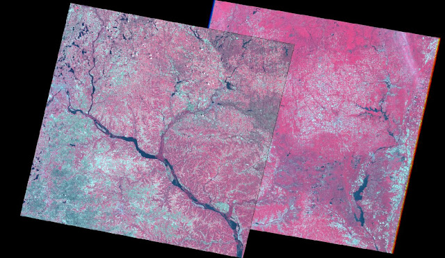 |
| Figure 5: This is the image formed after the initial setup has been completed for the image mosaic methods. |
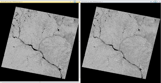
After this initial process was carried out, the first image mosaicking method was able to be performed. First, the Raster tab will be selected, then Mosaic, and MosaicExpress from the drop down menu. Next, when the Image Express window appears, the folder icon will be selected in order to input the correct images that were already opened in the viewer. The images are loaded, with the images in the correct order, as specified. Then, the correct input and output values were selected, the model was run, and the new image was created. That image can be seen in Figure 6. It can be easily noticed how much of a difference exists between the left image and the right image. The color difference does not allow for the images to blend together.
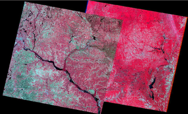 |
| Figure 6: This is the image created after MosaicExpress has been used to create a mosaicked image. |
Method 2: In order to begin this process the images had to be brought in a certain way. First the "Open" menu was selected, then the first image was chosen, but not loaded to the viewer. With the open menu still open, the "Multiple" tab was selected, then "Multiple Images in Virtual Mosaic". Then, "Raster Options" was selected, "Background Transparent" was made sure to be checked, then "Fit to Frame" was as well. From here the image was uploaded to the viewer. This same process was carried out with the second image. This image can be seen again in Figure 5.
After this initial process was carried out, the second image mosaicking method was able to be performed. First, the Raster tab will be selected, then Mosaic, and MosaicPro from the drop down menu. This brings up the MosaicPro window, as seen in Figure 7.
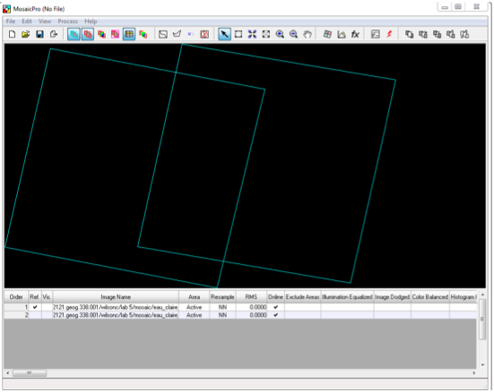 |
Figure 7: This image shows the MosaicPro window and the presence of the two images that were brought into the
viewer. This image was extracted from the assignment handout. |
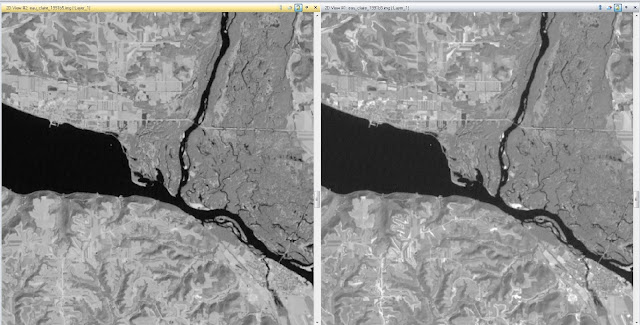
From this window, after experimenting with some of the buttons in order to better understand their functions, then next step was ready to be carried out. "Color Corrections" was selected from the top icon bar, as well as "Use Histogram Matching". Then, "Set" was selected and "Overlap Areas" was chosen from the drop down menu. After ensuring that the Overlap Function was correct by opening it up and selecting "Overlay", the image was ready to be mosaicked. "Process" was selected in the MosaicPro window, then "Run Mosaic". The correct input and output values were selected, the model was run, and the new image was created. This image can be seen in Figure 8. The image is much more blended than the image mosaic created using MosaicExpress.
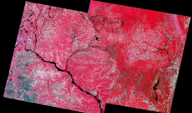 |
| Figure 8: This is the image created after MosaicPro has been used to create a mosaicked image. |
Using Figure 9, we can see that instead of the very noticeable difference in color that can been seen in the MosaicExpress image, located on the right, the MosaicPro image, located on the left, is much more clearly blended. With the MosaicPro image, there is a very noticeable overlap between the images, which is not present in the MosaicExpress image.
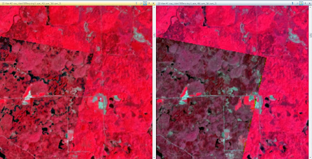 |
| Figure 9: The image on the left is the MosaicPro image, while the image on the right is the MosaicExpress image. |
Band Ratioing:
Purpose: Band ratioing is used to highlight subtle variations in spectral responses of various surface covers.
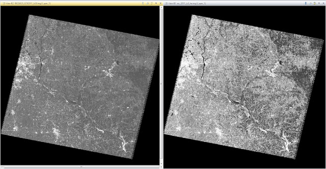
Method: An image of the Eau Claire area from 2000 was used to demonstrate band ratioing. First, the Raster tab was selected, followed by Unsupervised, and NDVI (Normalized Difference Vegetation Index) from the drop down menu. The correct input and output values were selected, as was the correct Landsat TM option. The model was run and the new image was created. The image can be seen in Figure 10. In this image, the very light areas characterize spots of vegetation, while the very dark areas are characterized by water. The medium gray areas denote urbanization.
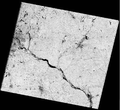 |
Figure 10: This image of Eau Claire from 2000 shows the normalized
difference vegetation index (NDVI). |
Spatial and Spectral Image Enhancement:
Purpose: Spatial and spectral image enhancement is used to sharpen and clarify images using a variety of different methods, including high and low pass filters, edge enhancement, piecewise contrast adjustments, and histogram equalizations.
Method 1: This method is for using a low pass filter. First, an image of Chicago was brought into the viewer. Then, the Raster tab was selected, followed by Spatial, and Convolution from the drop down menu. Under "Kernel" the option "5x5 Low Pass" is selected as the filter that is to be applied. The correct input and output values are selected and the model is run. This image can be seen in Figure 11. There does not appear to be much different with the image from the full extent view, except the new image (shown on right) seems marginally brighter.
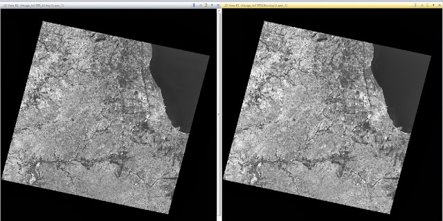 |
| Figure 11: This image shows the full extent of the Chicago area after low pass filtering has been administered. The image on the left is the original image and the image on the right is the image that has been filtered. |
After zooming in it is apparent that there is a substantial difference between the images (Figure 12). The images were synced and zoomed in until the difference was apparent. Once again, the image on the left is the original image, while the image on the right was the low pass filtered image. The resolution is substantially lower in the low pass filtered image than in the original image without filtering.
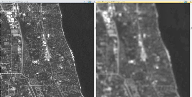 |
| Figure 12: This image shows the zoomed in view of the Chicago area after low pass filtering has been administered. The image on the left is the original image and the image on the right is the image that has been filtered. |
Following the administering of the low pass filter, the images were cleared and another image, this time of the Sierra Leone, was brought in for use. The next step was to demonstrate the use of a high pass filter. For this, same process was carried out as for the low pass filter, except for the choice of "Kernel". In this case, "5x5 High Pass" was selected for use, the model was run, and the image was created. This image can be seen in Figure 13. The new image is much darker, while the lighter qualities of the image were brightened.
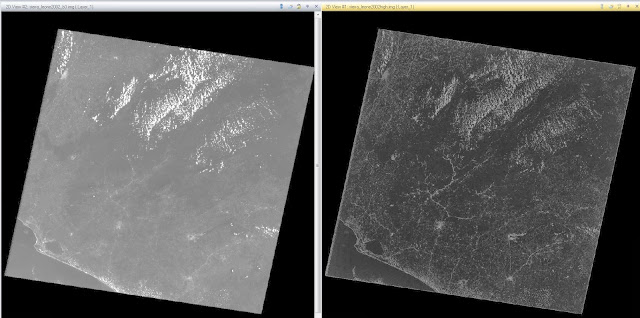 |
| Figure 13: This image shows the full extent of the Sierra Leone area after high pass filtering has been administered. The image on the left is the original image and the image on the right is the image that has been filtered. |
After zooming in it is apparent that there is a substantial difference between the images (Figure 14). The images were synced and zoomed in until the difference was apparent. Once again, the image on the left is the original image, while the image on the right was the high pass filtered image. With the use of a high pass filter, the darker parts were darkened, and the lighter parts were lightened. This gives the entire image a much more crisp look, which is apparent when comparing the images while zoomed in.
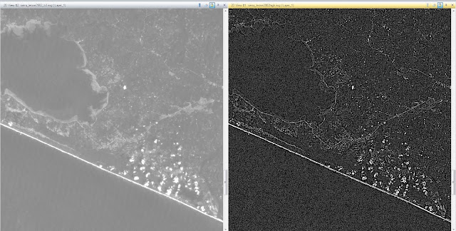 |
| Figure 14: This image shows the zoomed in view of the Sierra Leone area after high pass filtering has been administered. The image on the left is the original image and the image on the right is the image that has been filtered. |
Method 2: This method is for applying edge enhancement to an image. First, an image of Sierra Leone was brought into the viewer. Then, the Raster tab was selected, followed by Spatial, and Convolution from the drop down menu. Under "Kernel" the option "3x3 Laplacian Edge Detection" is selected as the filter that is to be applied. The "Fill" option was checked under "Handle Edges by" and "Normalize the Kernel" was unchecked. The correct input and output values are selected and the model is run. The new image can be seen in Figure 15. The new image is in the right panel of the figure. Zoomed out it does not seem to provide much for use.
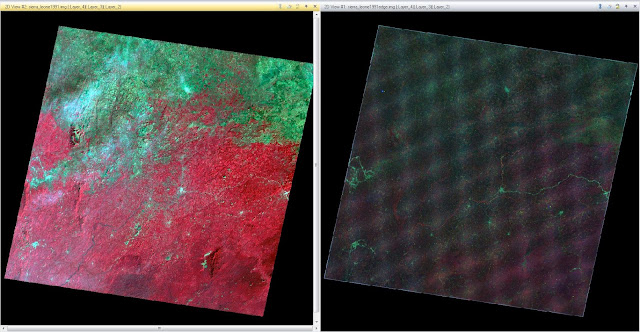 |
| Figure 15: This image is of Sierra Leone has had edge enhancement applied to it. The original image is on the left and the edge enhanced image is on the right. |
Zoomed in, there is much more that is apparent in the image. There is not as much blurring along the edges of features, such as the lake in the middle of the image. The color difference makes the edges of features much more apparent.
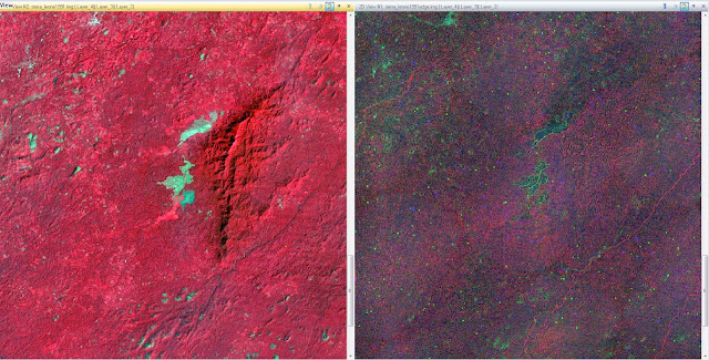 |
| Figure 16: This is a zoomed in view of the Sierra Leone image after edge enhancement has been applied. |
Method 3: This method is for applying a minimum-maximum contrast stretch and a piecewise contrast stretch to an image. The minimum-maximum contrast stretch is initiated by selecting the Panchromatic tab, then General Contrast, and then General Contrast
again, from the drop down menu. When the Contrast Adjust window opens the Method tab is selected and "Gaussian" is chosen.
The piecewise contrast stretch is initiated by selecting the Panchromatic tab, then General Contrast, and then Piecewise Contrast. Middle is selected under Range Specifications and then the last mode is changed to 180. Figure 17 shows the piecewise contrasted image. There is not much of a difference from the full extent view.
 |
| Figure 17: This is an image of the Eau Claire area after a piecewise contrast stretch has been applied to it. |
After zooming in it is apparent that the stretched image has been darkened slightly. The image on the left panel of Figure 18 shows this stretch.
 |
| Figure 18: The image on the left shows the stretched image, while the image on the right shows the original image. |
Method 4: This method is an example of a histogram equalized image. The image used is of the Eau Claire area and is the red band of a Landsat TM image capture in 2011. The Raster tab is selected, followed by Radiometric, then Histogram Equalization from the drop down menu. The correct input and output values were selected, the function was run, and the image was created. This image can be seen in Figure 19. The image on the left is the original image, while the image on the right is the newly created image.
 |
| Figure 19: This image of the Eau Claire area is an example of the effects of Histogram Equalization. |
The original image has a very low contrast, with most of the image being a gray shade. The newly equalized image has a number of variations in color, as seen by Figure 20. Many of the shades have been grouped and, as seen by the histogram on the right of Figure 20, the contrast is much more evenly distributed, and rather blocky.
 |
| Figure 20: This figure shows the histogram of the image that has been subjected to histogram equalization.The image on the left is the original image histogram, while the image on the right is the new image histogram. |
Binary Change Detection (Image Differencing):
Purpose: Binary change detection, or image differencing, is the process of estimating and mapping brightness values of pixels that have changed over a duration of time.
Method 1: To initiate this method, two viewers were opened with an image of Eau Claire County from 1991 in one viewer and an image of Eau Claire County from 2011 in the other. Both images were Fit to Frame and synced, the image was zoomed in and differences were noted before moving on. The Raster tab was selected, followed by Functions, and then Two Image Functions. In the window that was opened, the new image was input into the first input file and the old image was input into the second input file. The "Operator" was changed from (+) to (-) and the Layer under the first input file was changed to Layer 4. The function was run and the new image was created. This image can be seen in Figure 21. This image does not show where the change took place, however. This will be determined in the next method.
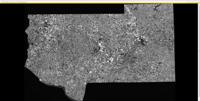 |
| Figure 21: This is an image of the Eau Claire County that has had the 1991 image subtracted from the 2011 image. This method does not show what change has occurred between the two images. |
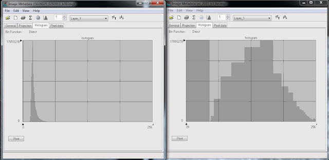
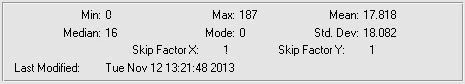
The next step was to estimate a threshold of change-no change. To do this, the Image Metadata was opened. First the General tab was looked at and the Mean and Standard Deviation were noted. In this case, as seen in Figure 22, the Mean is 12.253, while the Standard Deviation is 23.946. In order to determine the change-no change threshold, the equation Mean + (1.5 x Standard Deviation) was used.
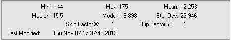 |
Figure 22: This shows the Statistics of the Image Metadata window. This is used to acquire the Mean and Standard
Deviation figures for this image. |
To determine what the initial number used is, the histogram is opened and the cursor is placed in the center of the histogram and that number displayed is recorded. The histogram used in this example can be seen below in Figure 23. After the number is recorded, the correct numbers are input into the equation noted above, and the result of this is added to the number of the center of the histogram. The same process is repeated to figure out the lower threshold as well.
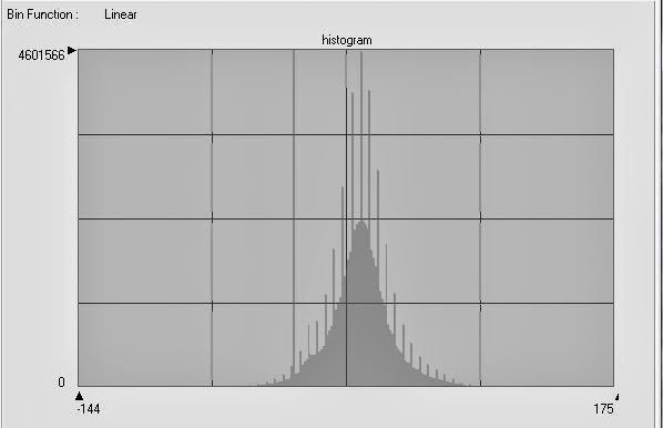 |
| Figure 23: This image shows the histogram used in to determine the change-no change threshold for the previous section. |
Method 2: This method practices the use of Model Maker to create and analyze images. The Toolbox tab is selected first, followed by Model Maker, and Model Maker
again from the drop down menu. First, two raster images are added to the Model Maker, followed by a Function, followed by another raster image. They are connected by arrows that represent the flow of the work. The 2011 Eau Claire County Band 4 Image was loaded into the top-left raster followed by the 1991 Eau Claire County Band 4 Image into the top-right raster. A function was developed to show the change that had been subtracted from the 2011 image. This function is shown by "$n1_ec_envs_2011_b4 - $n2_ec_1991_b4 +127". This image is loaded into the output raster at the bottom of the Model Maker. This progression is seen in Figure 24.
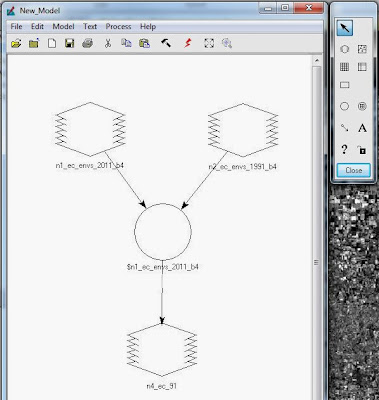 |
| Figure 24: This image shows the Model Maker for the previous section. |
Next, the image that was created in the previous step is opened and the workflow carried out to determine the change-no change threshold is repeated. This time, the equation to determine the threshold is Mean + (3 x Standard Deviation). The Statistics used in this example can be seen below in Figure 25 and the Histogram can be seen in Figure 26.
 |
| Figure 25: The Statistics panel, showing the Mean and Standard Deviation for the raster created in the previous step. |
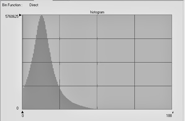 |
Figure 26: This image shows the histogram that was used to determine the change-no change threshold for the
previous step. The center of the histogram was determined in order to input the value. |
Another Model Maker window was opened and a raster, function, and another raster were added to the window, connected by arrows to show work flow. The first raster image contained the raster created in the previous step. The function window was opened and the function was changed from Analysis to Conditional. From here the "Either IF OR" option was chosen and added to the function building window in the bottom of the Function Definition window. The change-no change threshold value was used and input into the function which reads: EITHER 1 IF ( $n1_ec_91> change/no change threshold value) OR 0 OTHERWISE. This seems to act as a basic binary code. The 0's are turned off and the 1's are turned on. This allows the features that registered as "Changed" to appear and the features that registered as "Not Changed" to not be apparent. Then, the output raster was added to the bottom raster image, the function was run, and a new image was created. The Model Maker can be seen in Figure 27.
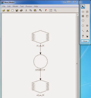.JPG) |
Figure 27: This image shows the Model Maker for the
previous workflow. |
The image below, Figure 28, shows the result of the binary raster output. In this image, the white areas represent the 1's (turned on), while the black areas represent the 0's (turned off).
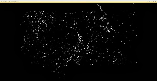 |
Figure 28: This figure shows the raster output from the binary change function. The white areas represent the changed
features while the black areas represent features that did not register as changed. |
Finally, the last part of this process was ready to be carried out. ArcMap 10.2 was opened and the rasters were brought into a new map. The red areas show the areas that registered as "Changed". The areas that are not red are areas that did not exhibit any measurable change in their features. This can be seen in Figure 29.
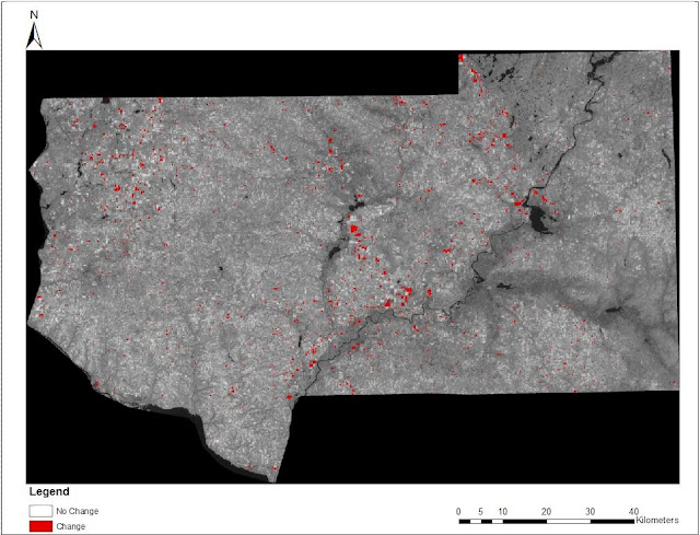 |
| Figure 29: This image shows the rasters brought into ArcMap. A legend, scale, and north arrow were added to make the map easier to read. |
Results:
This assignment was very useful to begin to understand the various methods of enhancing images to make them more easy to analyze. Through RGB to IHS transformations, image mosaicking, spatial and spectral image enhancement, band ratioing, and binary change detection the analyst is able to expand their arsenal to tackle many different issues that may be faced.


.JPG)
